Did you know that the font and color you choose for your custom LED signs can have an impact on your marketing purposes and ROI?
Take it from Apple, they use different fonts and colors to achieve their goals.
On their website, for example, iPad Air 2 is written in lightweight Myriad while the rest of the text is in Sans. The color combination is predominantly white, with the call to action in blue and the header in gray. All these work together to create well-organized custom LED signs.
This underlines the importance of gaining a better understanding of how color and fonts work on human psychology. When you do, it will be easier for you to choose the best options for your brand.

How Humans Associate Certain Colors in Brands
Blue: competence, trust, corporate, high quality, stability
Black: classiness, sophistication, mystery
Brown: ruggedness, nature
Green: nature, growth, freshness, fertility
Red: lust, excitement, love, passion, warmth
Pink: sophistication, sincerity
Purple: power, authority, elegance, royalty
White: happiness, sincerity, purity
Yellow: competence, happiness, joy, intellect, energy
When you combine colors, you will be able to create different perceptions that you want your target market to perceive.
In choosing colors to use, think of a palette rather than a single shade.
There should be a dominant or driver color and the rest as the shades that will keep the driver colors grounded on custom LED signs.
McDonalds, for example, is a combination of red and yellow, with red as the dominant. Pepsi, on the other hand, has blue as a driver color.
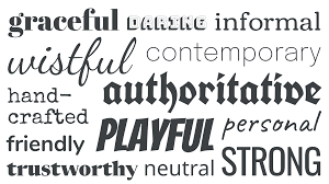
How Humans Associate Popular Fonts in Brands
Century Gothic: Chic
Calibri: Clean
Baskerville Old Face: Reliable
Times New Roman: Tradition
Georgia Italic: Comfort
Helvetica Bold: Stability
Myriad Italic: Modern
Apart from choosing the fonts to use, you also need to decide between serif and sans serif. The former often conveys professionalism and experience and is used by traditional brands, while the latter is often viewed as more modern and appeals to younger and hipper brands.
Different fonts should be used for different tasks as well.
Although consistency is important in your marketing materials, it is best to divide and conquer when using fonts. What you use on your logo is not necessarily what you should use for your body copy or headlines.
Just make sure that the fonts support and enhance each other rather than compete on custom LED signs.
How to Combine Fonts and Colors
Once you’ve picked a font and color, you need to blend them together into your marketing media.
To ensure maximum effect, the combination should:
Be Readable
Whether written big or small, your logo or brand should be readable. This is why the simplest fonts usually work the best in terms of branding.
Work on Media with Different Sizes
Whether used on a website, letterhead, business card, or billboard, your brand or logo should remain clear and displayed properly. It should not be blurred and condensed when used on a business card or stretched out when used on a billboard.
Be Consistent
The brand colors and fonts you use must be consistent in all your marketing media. Even if color consistency can differ between digital and print materials, make an effort to be consistent.


